FinTech Case Study
myStash Case Study
How myStash Website Redesign Increased Product Visibility, User Engagement, and Sales.
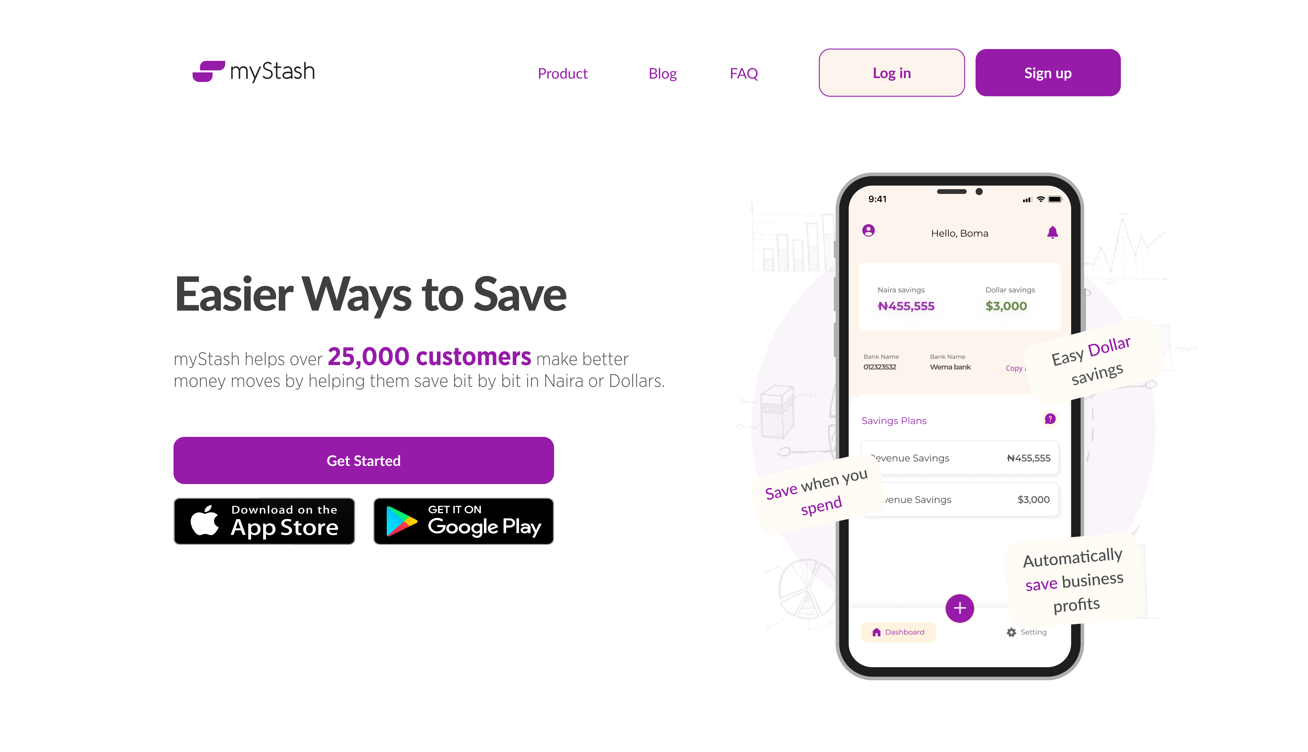
myStash is a fully registered and regulated finance management platform that aims to help young adults manage their finances and generate wealth. Users save efficiently through a save-as-you-earn model powered by automation and artificial intelligence.
The vision is to be the ultimate money management platform that helps young adults monitor, manage, and generate wealth in an autonomous way. The business has an average growth rate of 80% month on month and is backed by seasoned local angel investors.
myStash has grown over the years and introduced more products to its users, but on the website, it was difficult for users to know or learn about the product. Despite the fintech’s exceptional performance, it was not attracting enough users due to the lack of visibility of its unique features and products. Basically, it was facing an issue with its
Product visibility
User Engagement &
Sales.
To solve this problem, myStash decided to undertake a website redesign to bring its hidden gems front and centre, thereby increasing its product visibility, user engagement, and sales.
A team of 3 - the CTO, 2 product managers and myself as the product designer, undertook a comprehensive analysis of user feedback, market trends, and industry best practices to identify the pain points and challenges faced by users when navigating the platform.
We also conducted an in-house review of the existing websites by asking people from other teams, the Growth & Sales team, Content & Marketing teams, as well as the Customer Acquisition and Support teams, about what users were saying about our products and the websites.
The research revealed that the primary issues were related to the platform's complexity, lack of clarity, and difficulty in finding relevant information about the products offered by myStash.
Based on the research findings, myStash began the design process with a focus on simplifying the user interface, enhancing the visual appeal, and highlighting the platform's unique features.
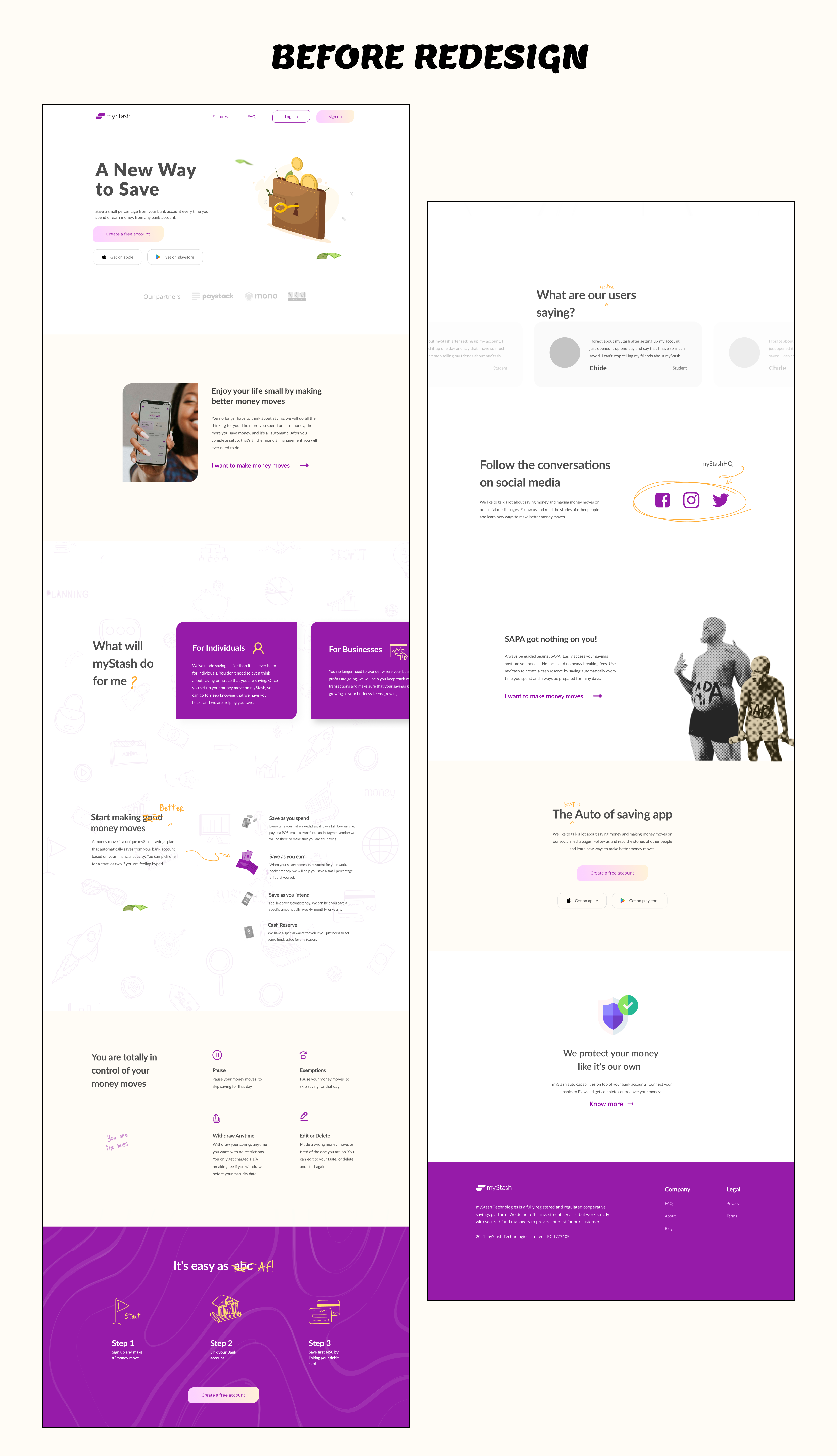
The website was redesigned with a clear and concise user interface, making it easy for users to navigate and understand the different sections.
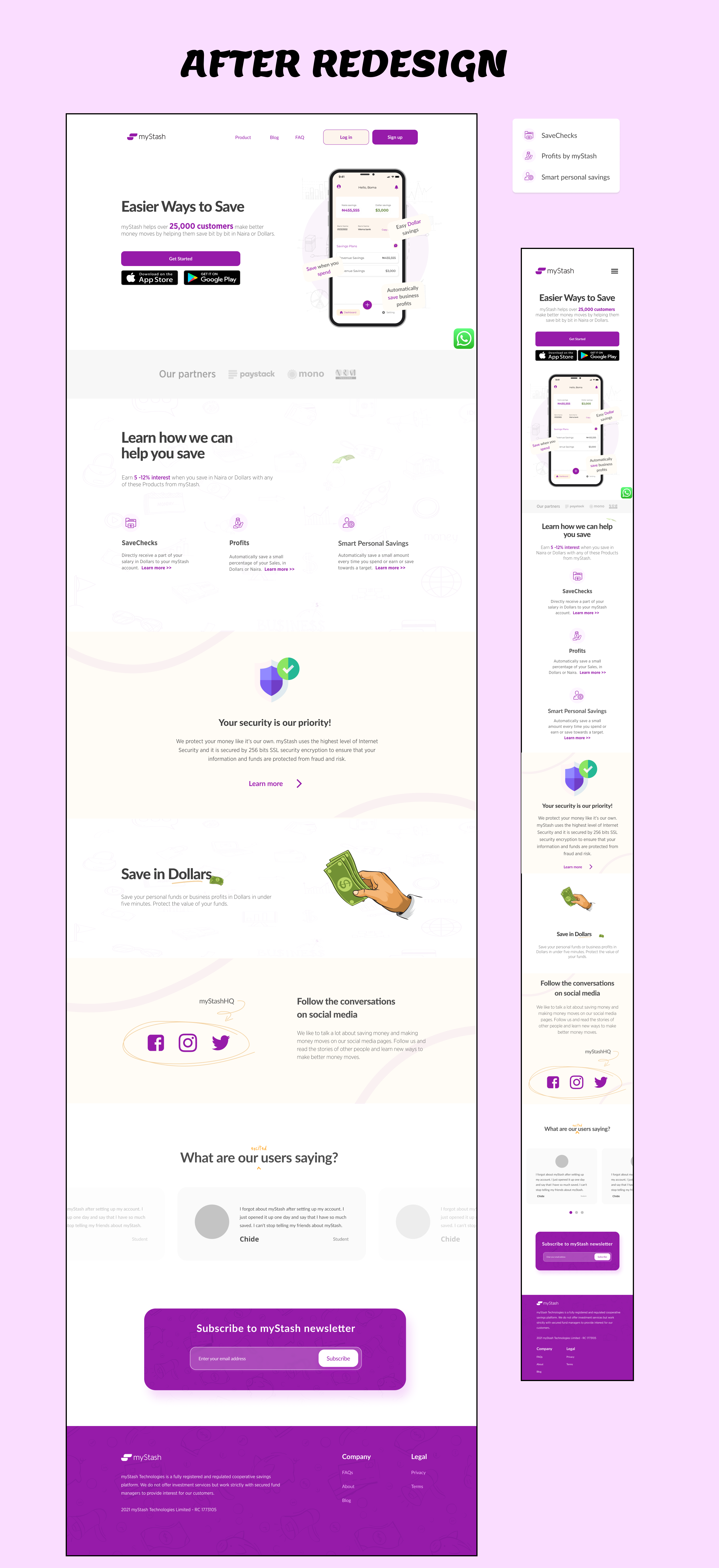
The new design also placed the most important features, at the forefront, making them more visible and accessible. Key deliverables and results:
Short and concise landing pages stating clearly key product offers.
Landing page for every product myStash offers its users.
Improved blog section.
New navigation showing product offers.
Improved copy & UX Writing.
Responsive design across both mobile and desktop screens.
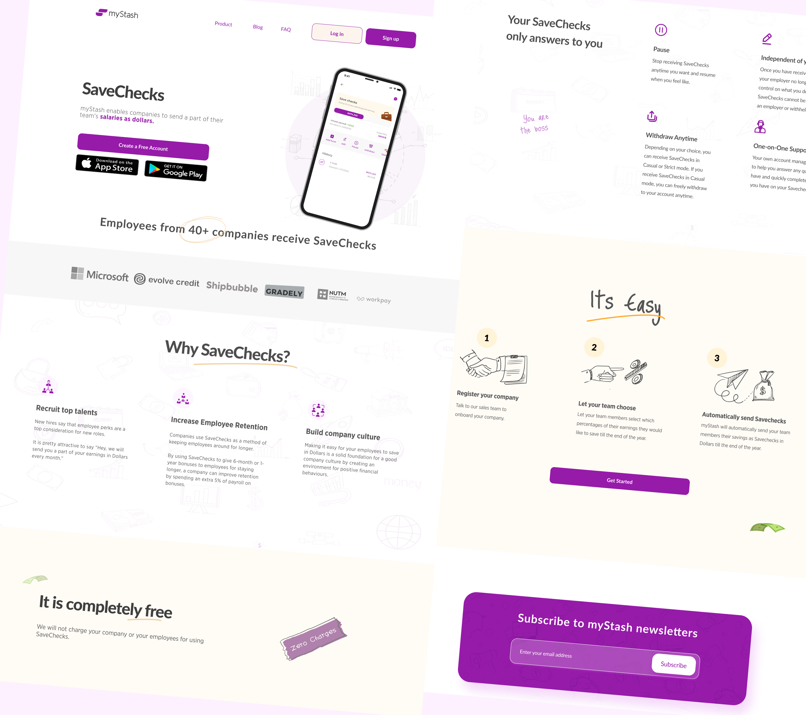
myStash offers dollar savings that allow anyone in Nigeria to automatically save in dollars at their preferred pace and your specified amount.
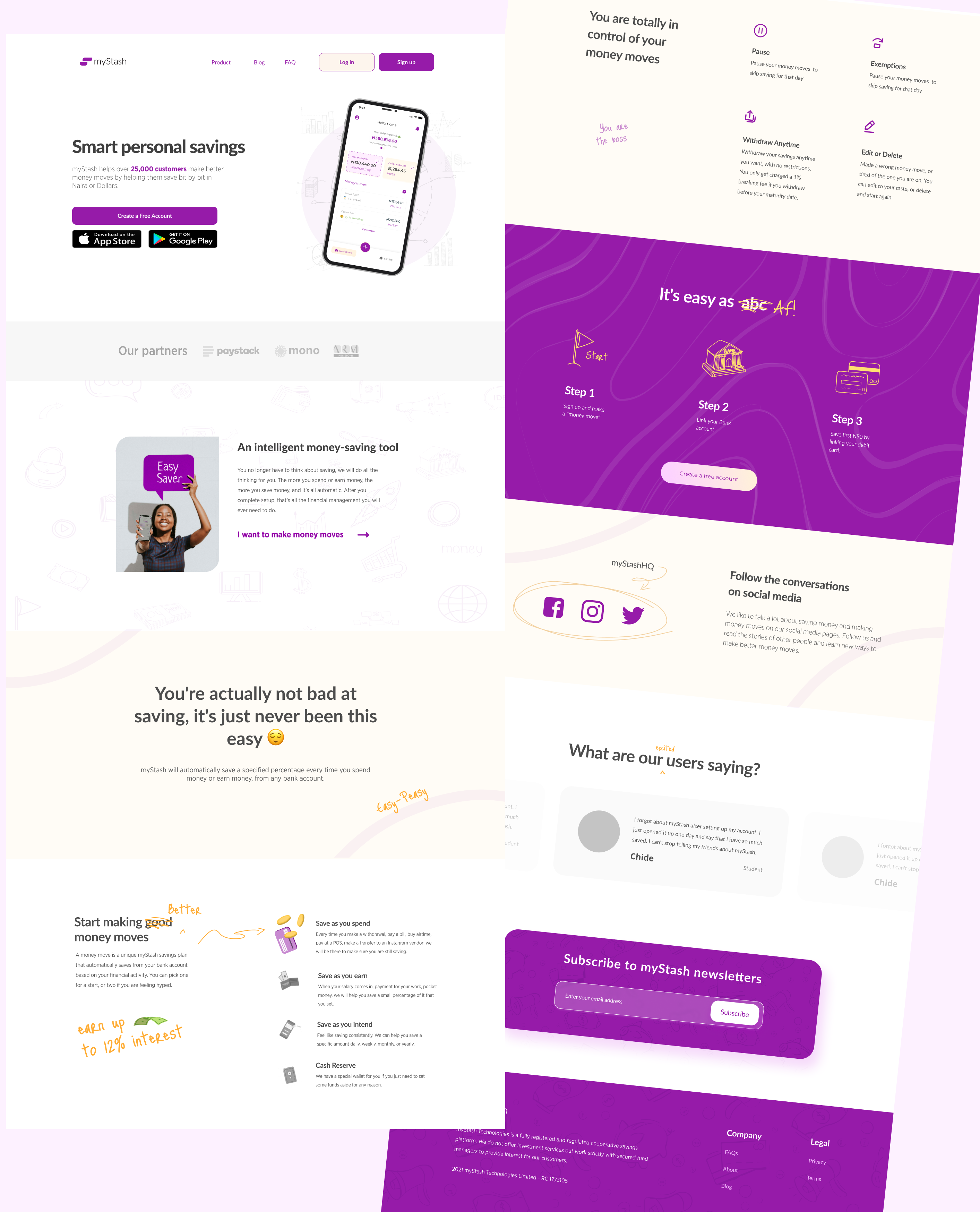
This is a pension-style saving that enables you to save directly from your paycheck. A percentage of your salary is saved in dollars monthly. You have access to your funds at all times and are in complete control.
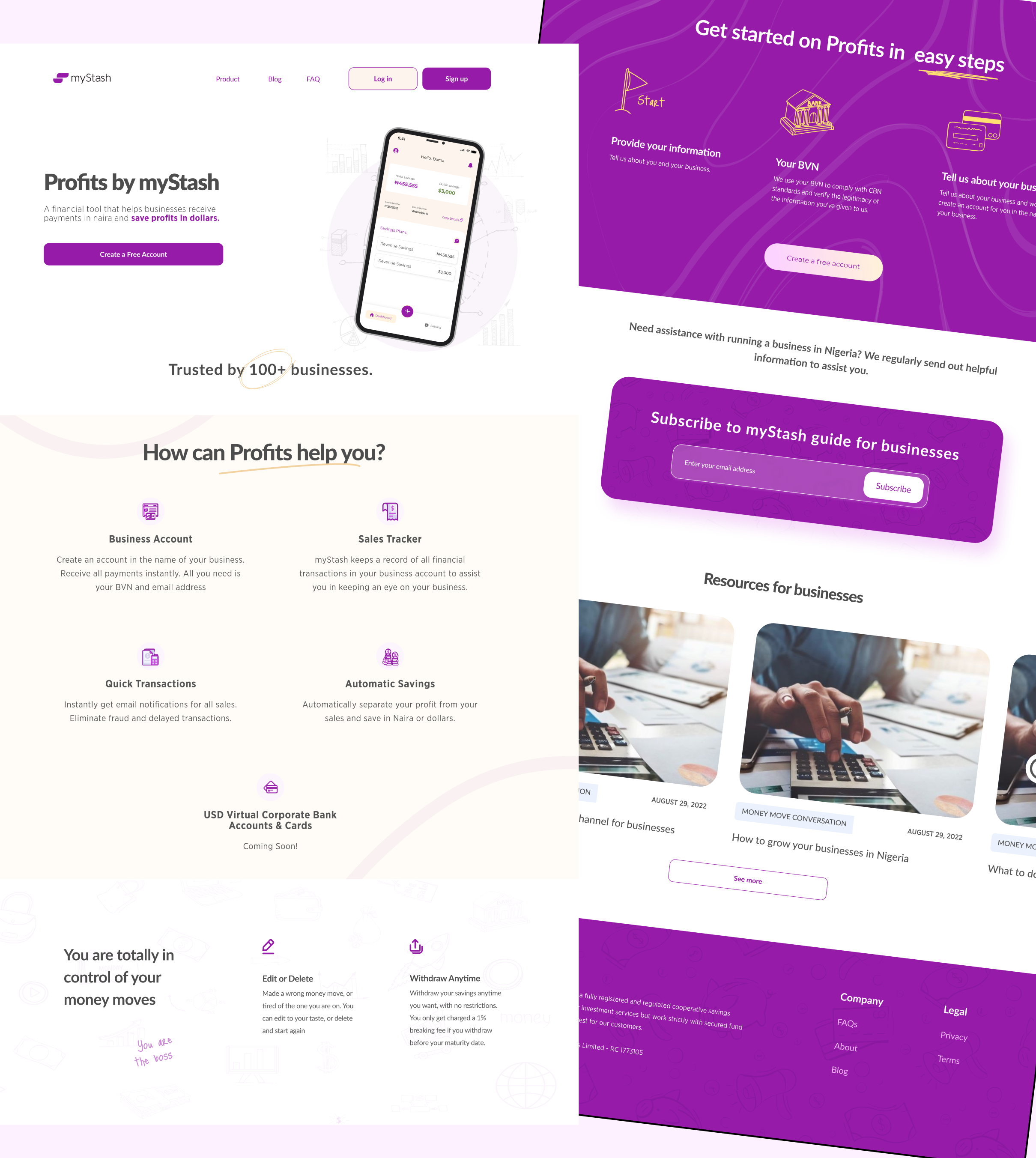
This product is for business owners looking to separate their costs and profits. This product helps you immediately split funds received from customers into a profit account thereby enabling you to manage your business finances better.
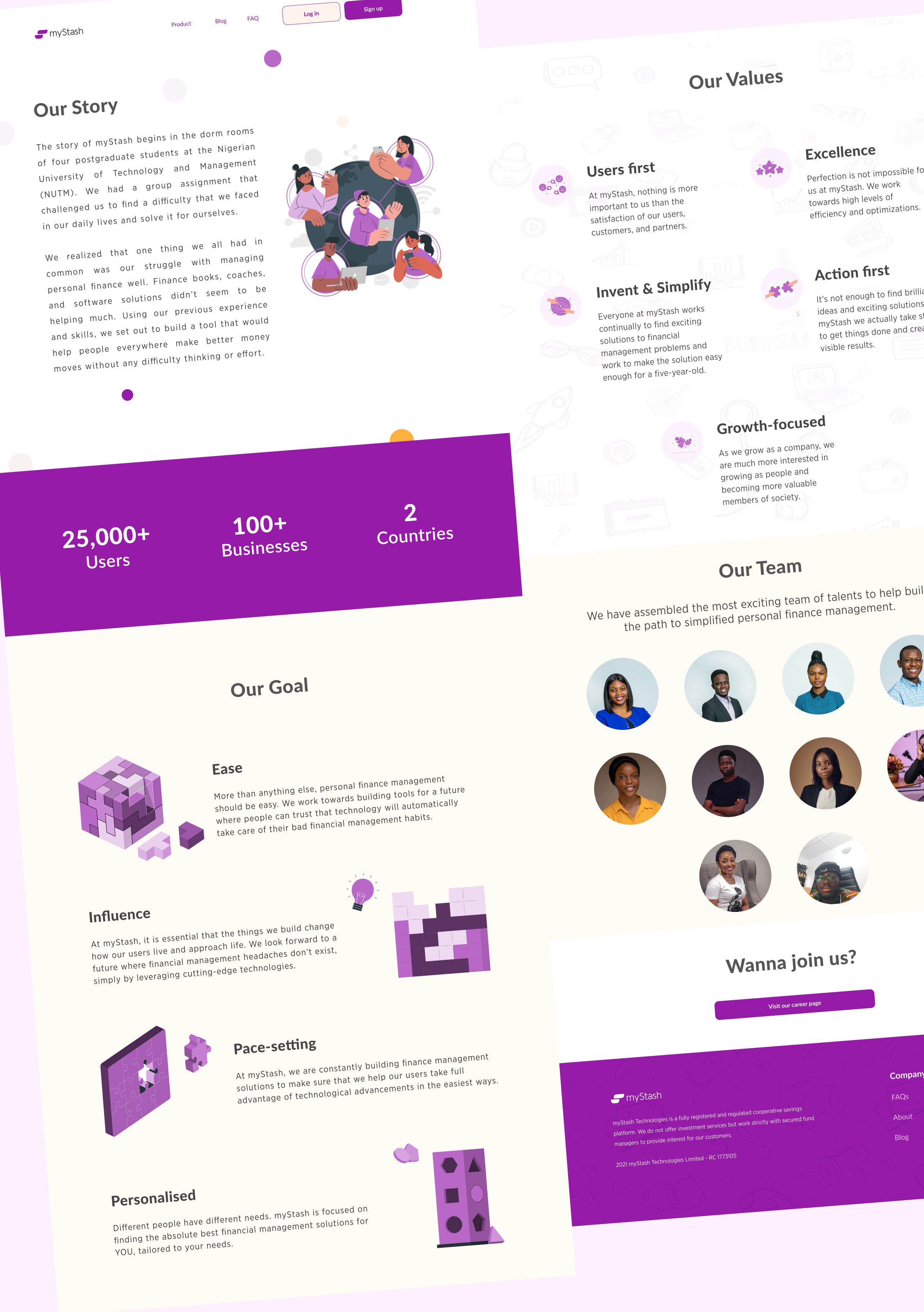
After designing the new platform, the team conducted extensive testing in-house and with some of the users to ensure that the new design was first, responsive to the majority of the devices used by our customers, ensuring it was intuitive and easy to use.
Once the design was finalised, myStash moved on to the development stage. The website was rebuilt using Astro, increasing user engagement by 70% and performance by 80%. The engineering team worked to ensure that the website was optimised for speed, security, and mobile responsiveness. They also implemented various features, such as a live chat system - WhatsApp, to enhance user engagement and provide a seamless experience.
The redesign of the myStash website had a significant impact on the platform's visibility, and user engagement, and ultimately, increased sales.
The platform saw a 60% increase in website traffic within the first month of launch, and the bounce rate decreased by 40%.
Users were spending more time on the website, indicating increased engagement, and the number of sign-ups increased by 80%.
The platform's monthly active users increased by 60%, and the company's growth rate increased to an average of 120% month on month.
Furthermore, the platform's customer satisfaction score increased from 3.5 to 4.5 out of 5, reflecting a significant improvement in user experience.
The redesign of myStash's website was a resounding success, leading to increased product visibility, user engagement, and sales.
The company's success serves as a testament to the importance of user-centric design and the value of continuous improvement in UX design.
By focusing on improving the user experience and making key products more visible, myStash was able to attract and retain more users, ultimately leading to higher revenues and a stronger business overall.dd more engaging content.